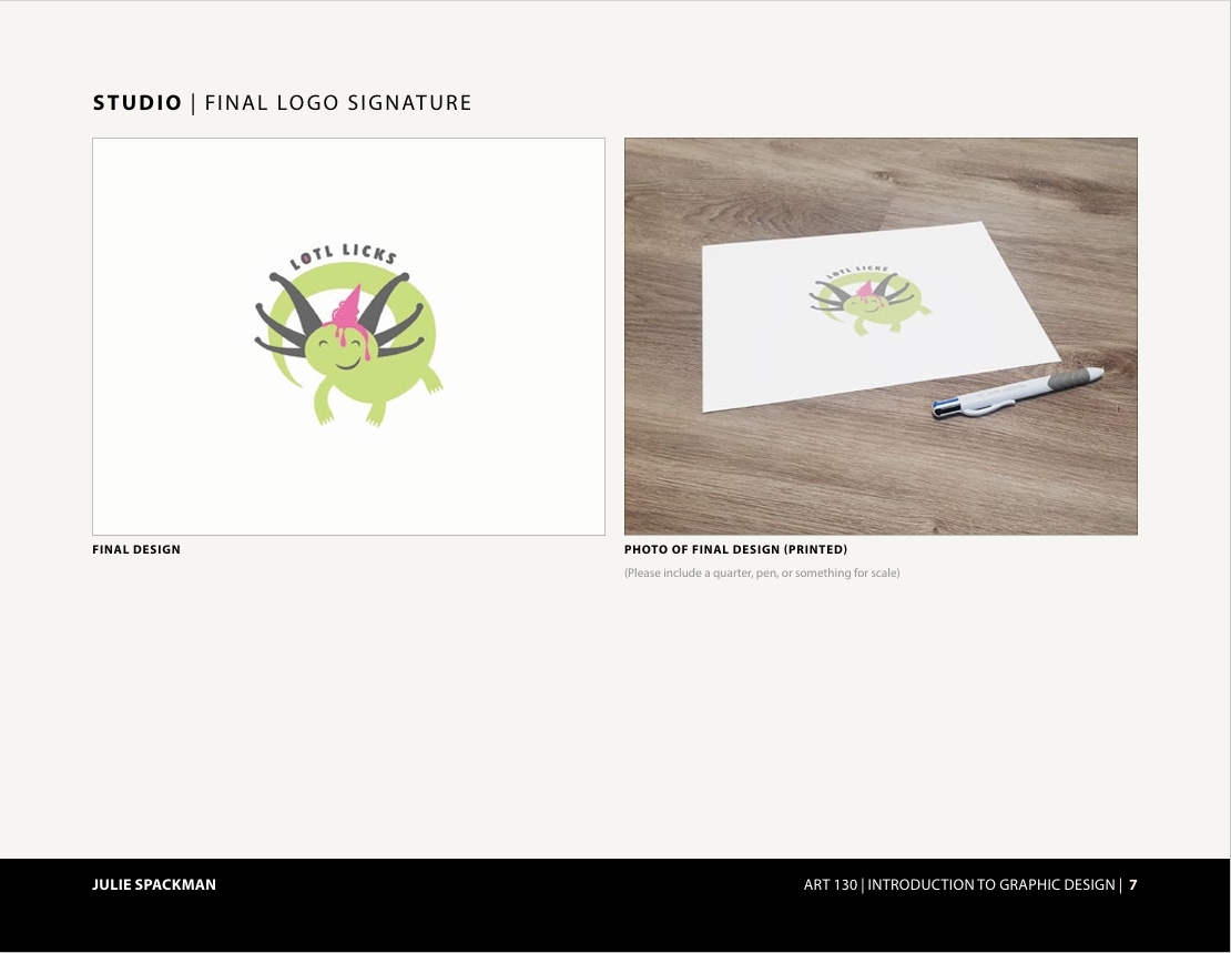
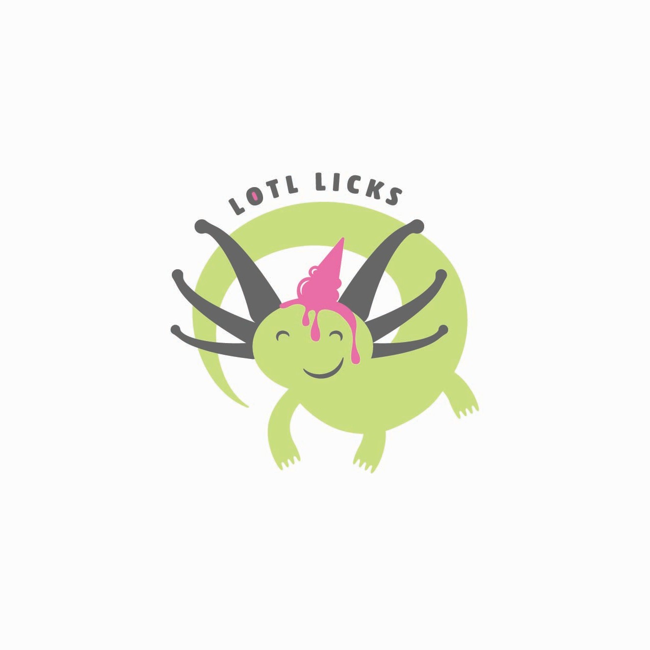
I have never loved a logo the way I love this logo. I have also never put in as much work in a logo as I have put into this little guy!
The class assignment was to create a logo for a fictitious business of our making. We were given a list of business types to select from, such as a food establishment, a clothing store, or a bookstore. Then we had to select an animal to use as a mascot, and create a name for our business. The logo had to have the animal, the name, fit within a square-ish shape, and could only be 3 colors.
I love ice cream, so that was an easy pick. I also love books, but I suspected that many of my classmates would go with a bookstore (and I was correct), and I wanted to do something different than the crowd. It was probably a similar line of thinking that had me land on an axolotl for my mascot.
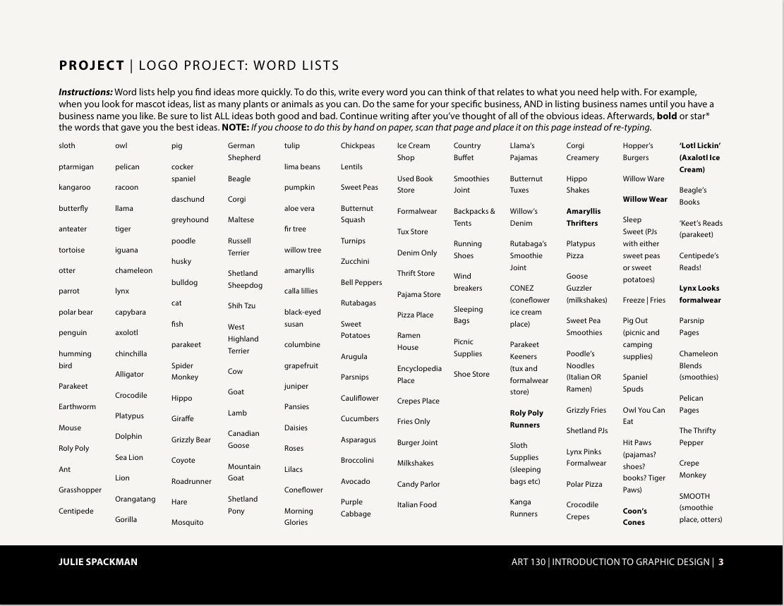
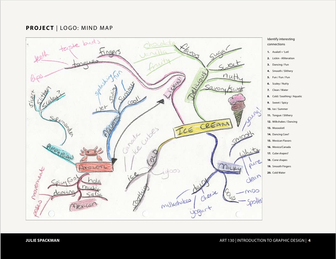
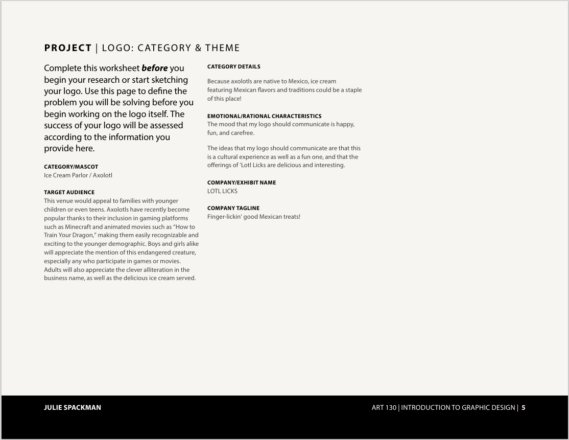
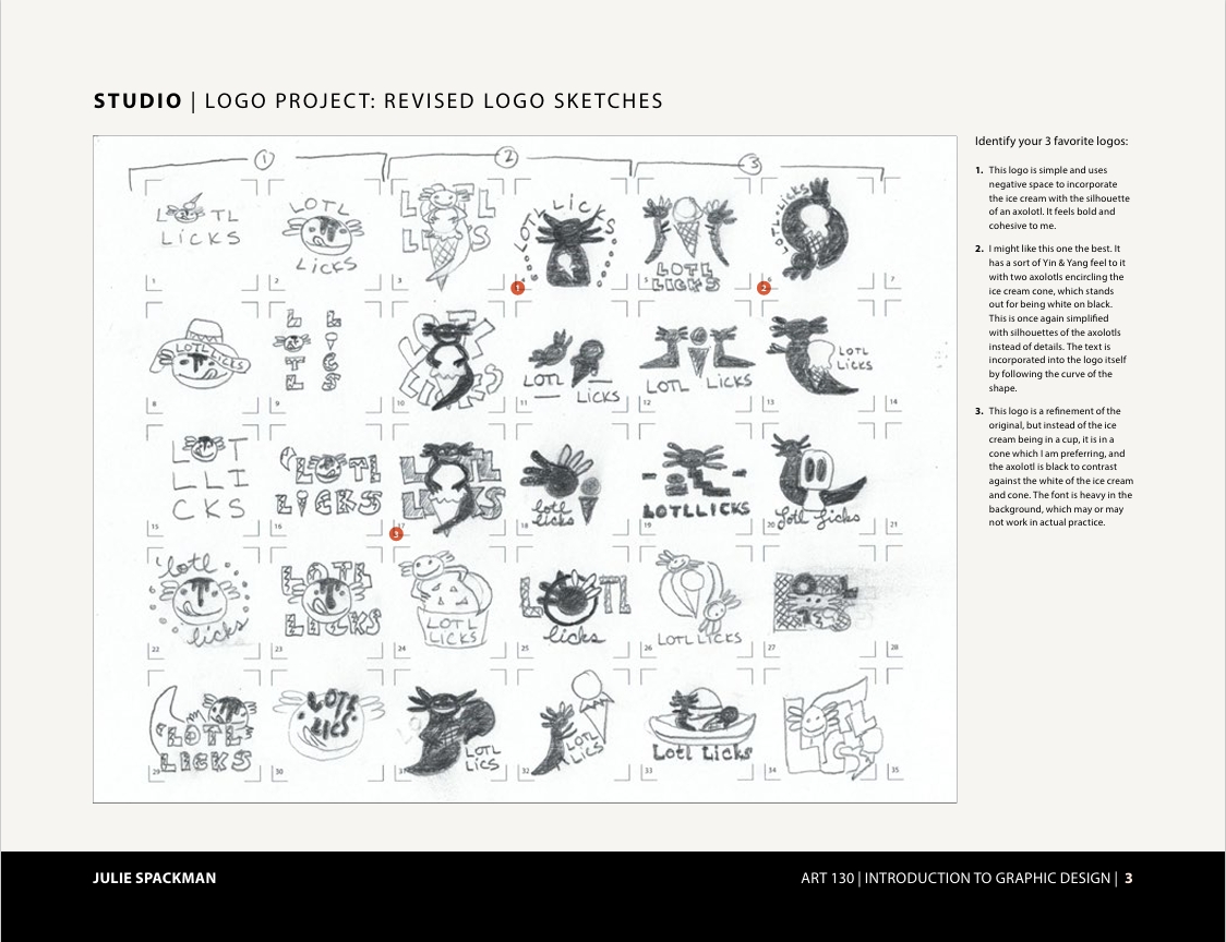
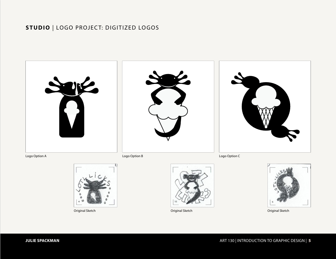
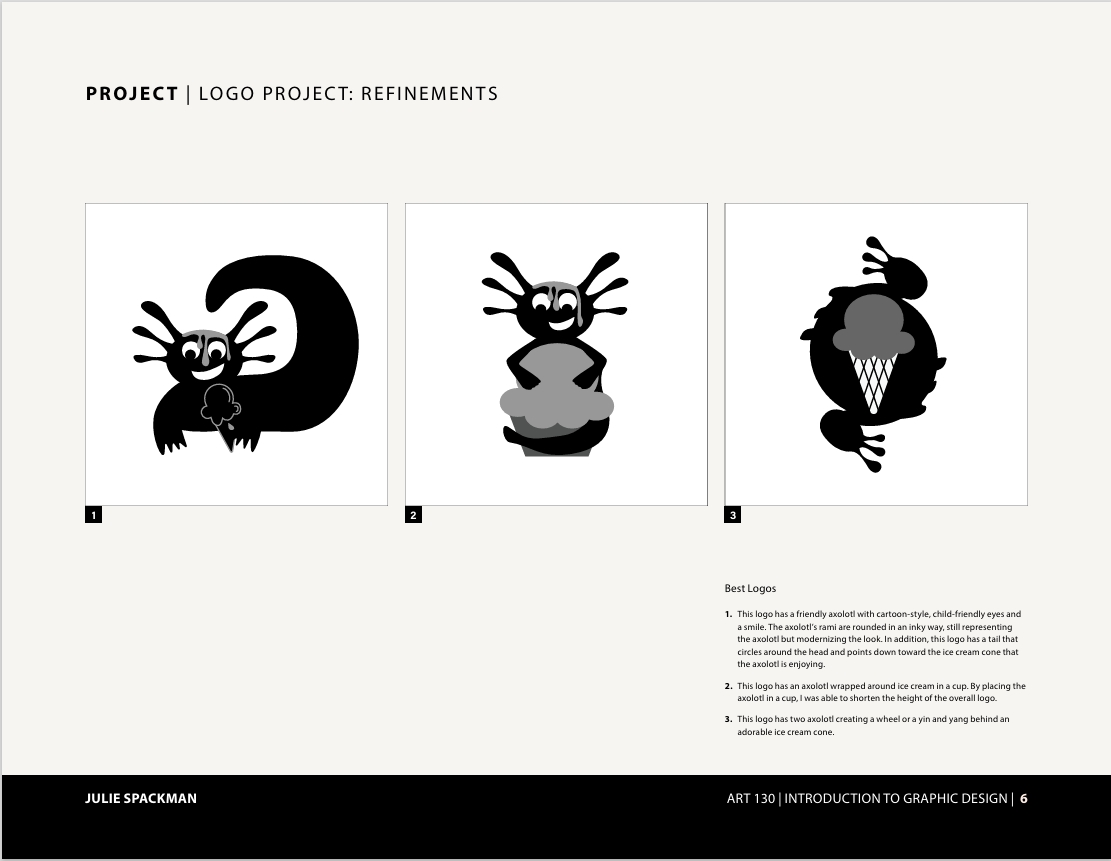
We kept a process book each week of this project, where we compiled our brainstorming, our research, and our drafts. We did some market research of our business type and of our animal, and then we started doing sketches. There were several times during this project that I was kicking myself for trying to pair an axolotl with an ice cream joint. Who finds ice cream appealing when there's a slimy creature on it?!?
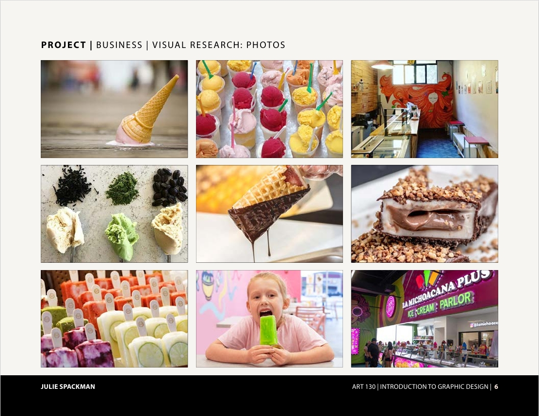
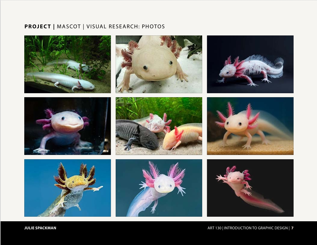
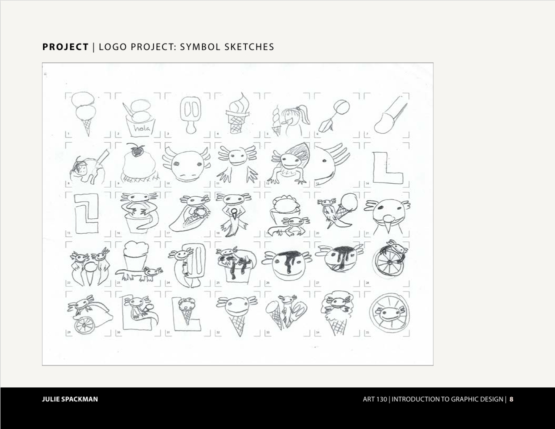
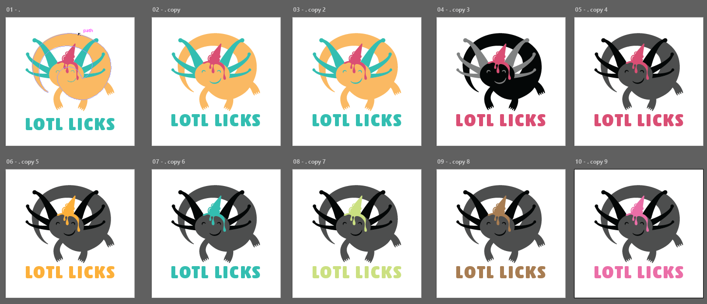
When we finally got to start using color, moving away from greyscale-only, it was very exciting!
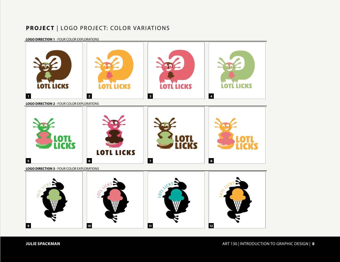
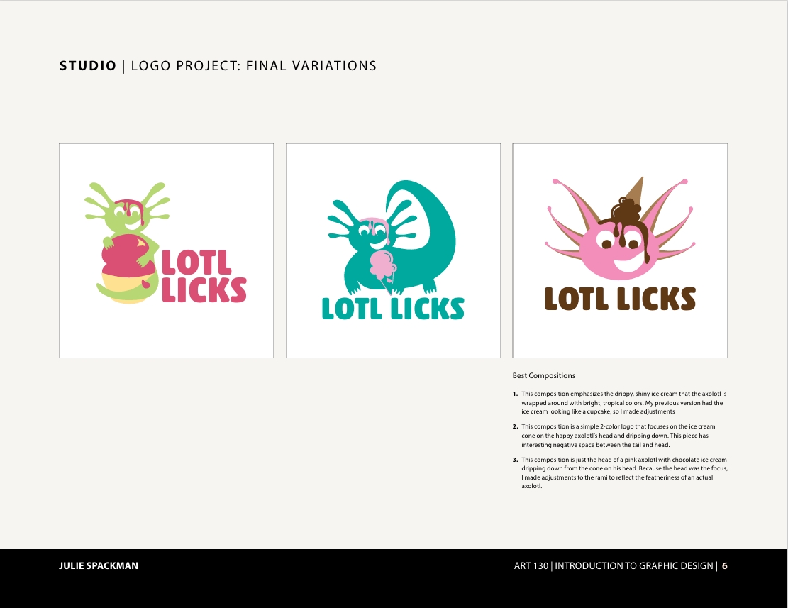
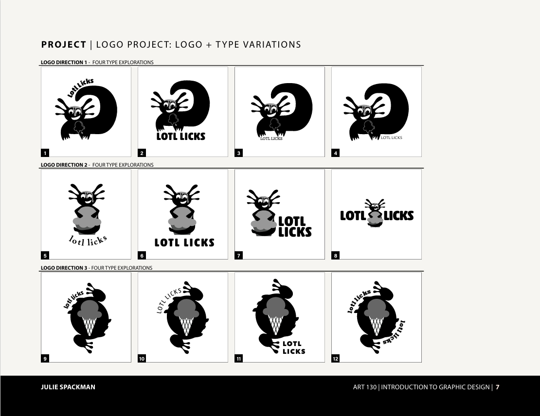
Now, I have to laugh at this point. Because the last page was titled, "FINAL VARIATIONS," but the truth is that between that page and the next page titled, "FINAL LOGO SIGNATURE," there was actually a lot MORE work!
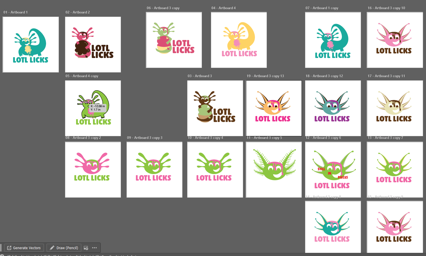
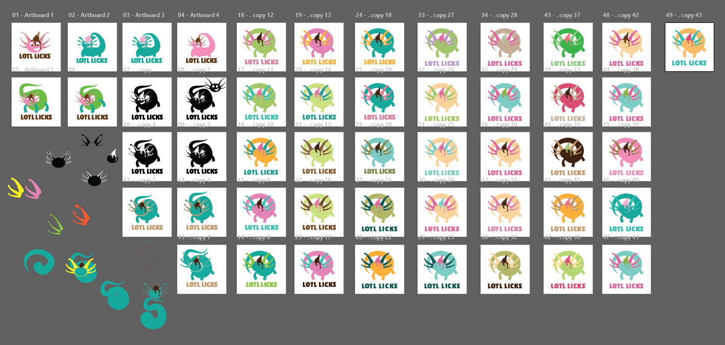
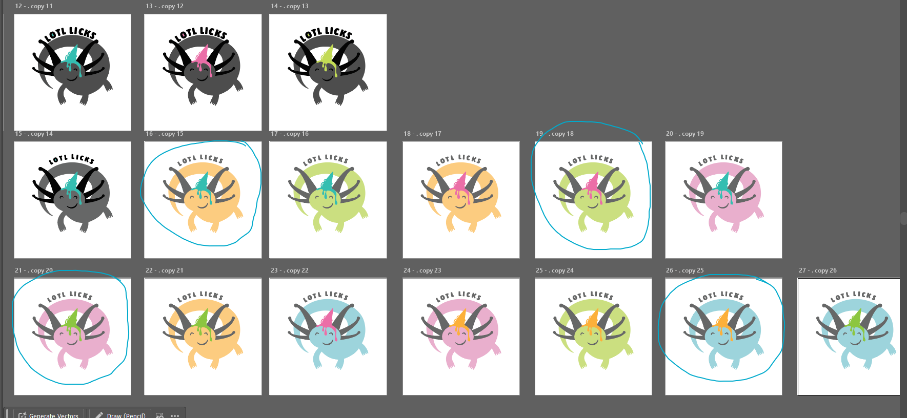
I really wanted my logo to be more rounded, clever, and to give me that "YES" feeling of a project well done. So I didn't stop until I got there. But this is what that process looked like:

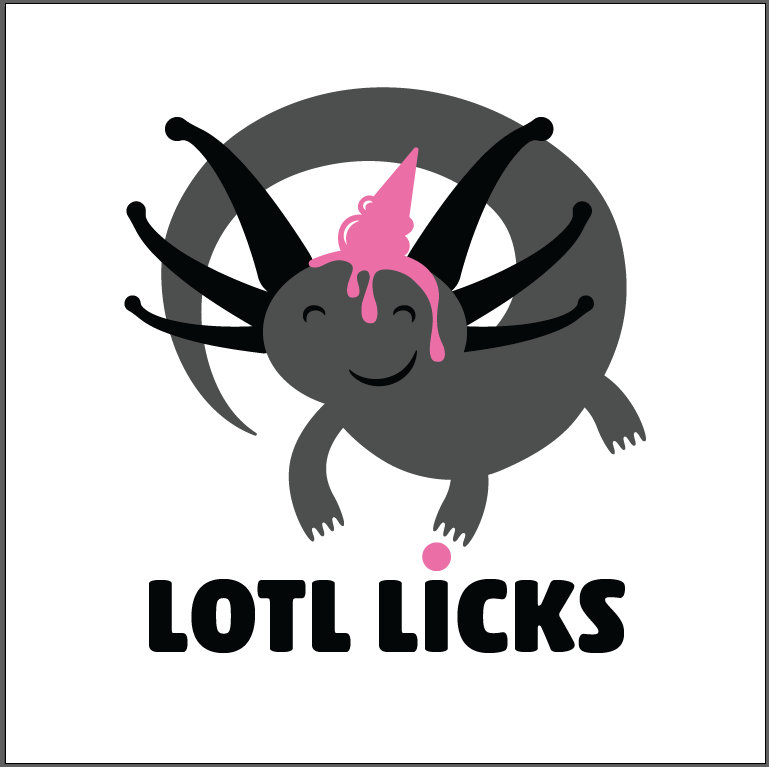
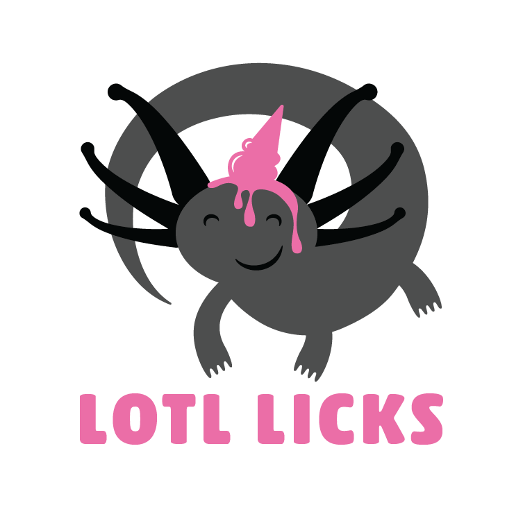

And then finally, I got that zing. I hope you love him as much as I do!