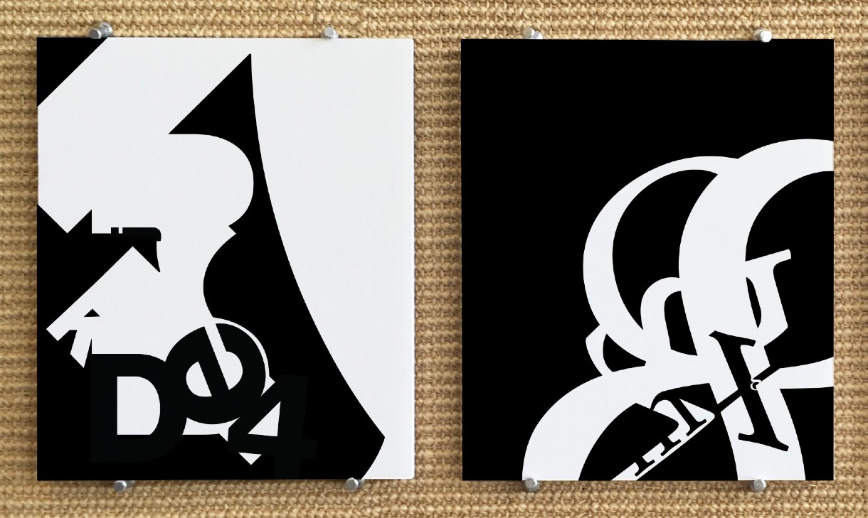
I took a Typography class, which really got me thinking in new ways.
Our first project was to create two designs in only black and white: one using glyphs from a sans-serif font family, Neue Haas Grotesque Bold, and one using glyphs from a serif font family, Stempel Garamond Roman. No repeated glyphs, no outlines, and each composition was required to have at least 5 characters in it.
Of course, being a Graphic Design course, we needed to begin with rounds of sketching and then digital sketching for each composition. There were rounds of peer critiques and editing which is difficult to show here.
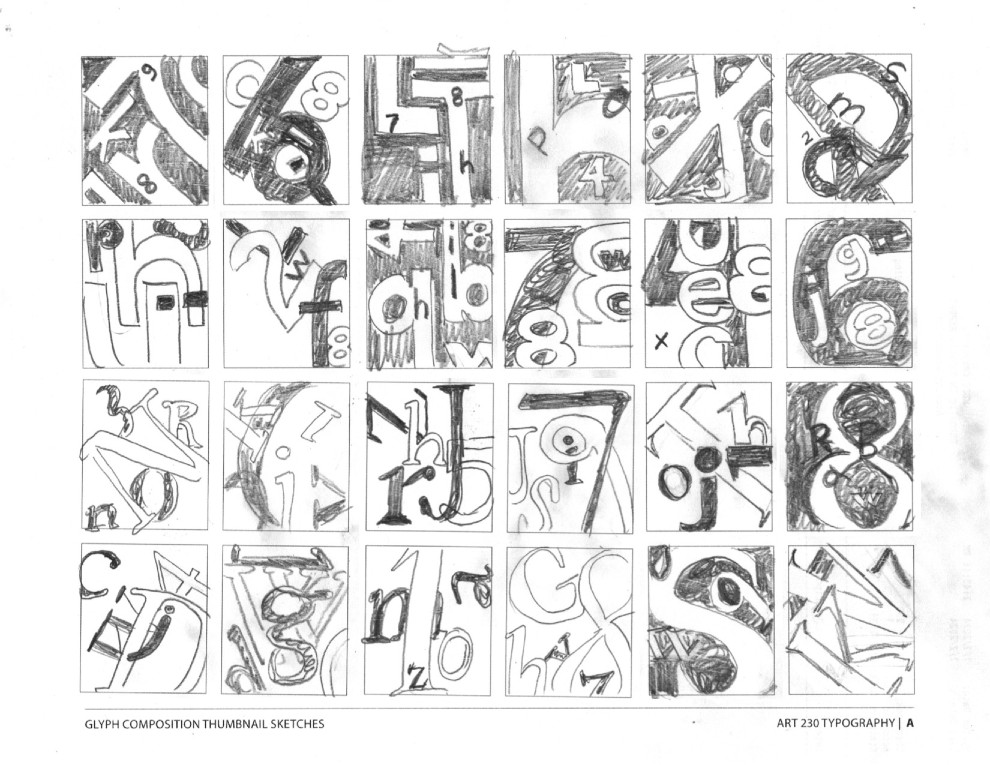
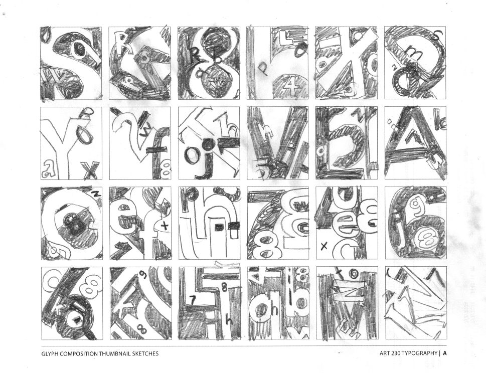
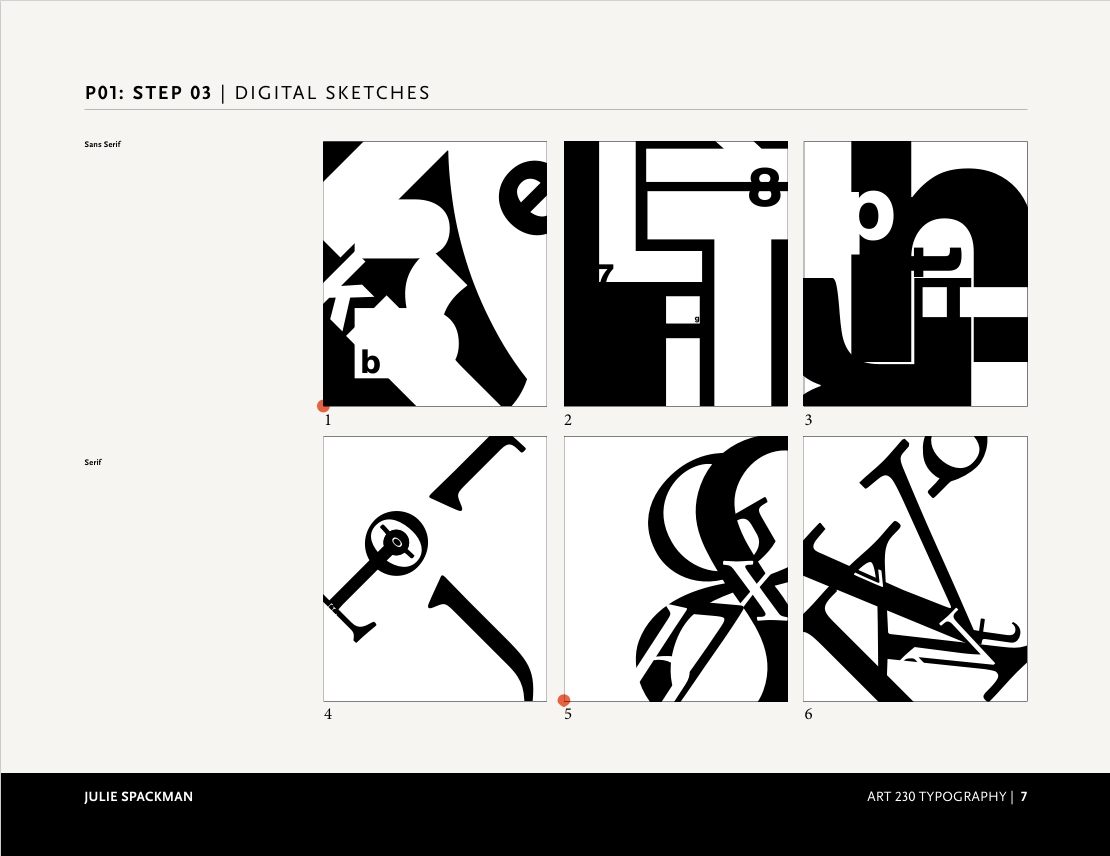
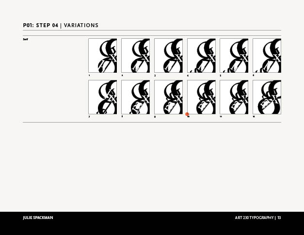
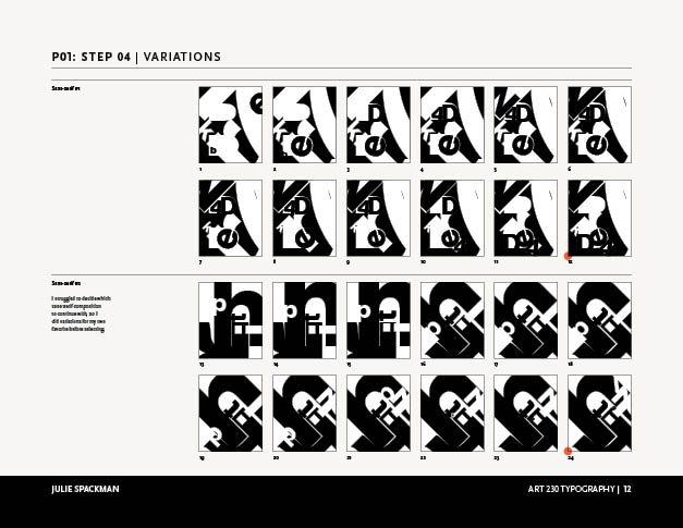
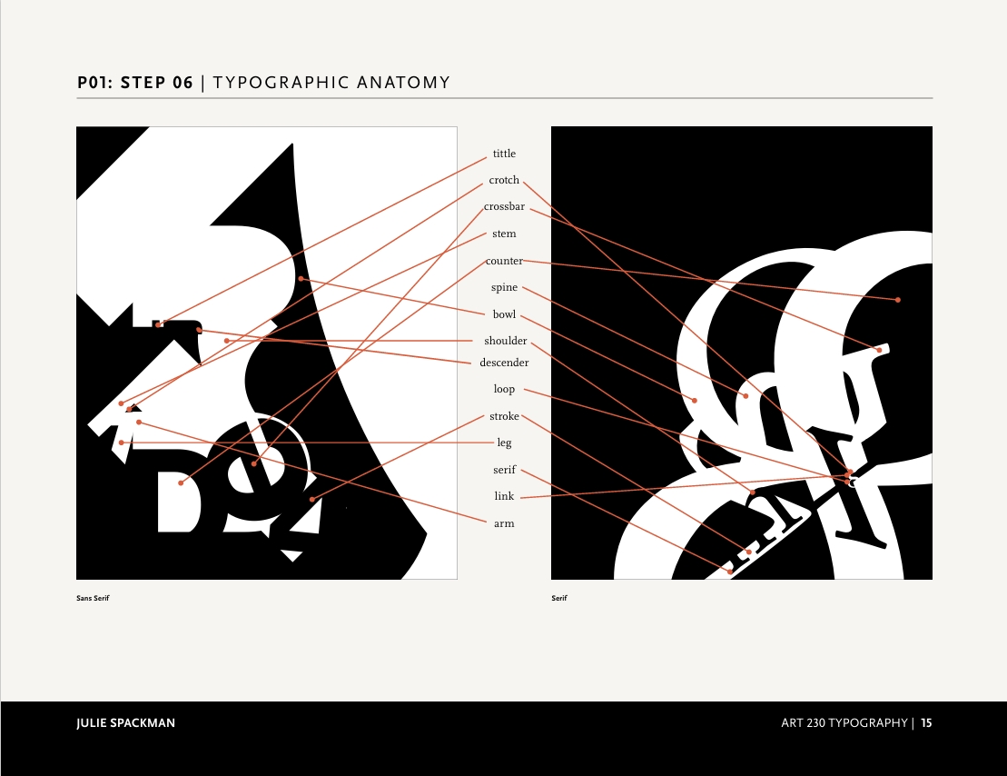
I learned all abou the anatomy of glyphs, and it was satisfying using such basic elements but to still consider design principles like alignment, proximity, scale, and repetition.
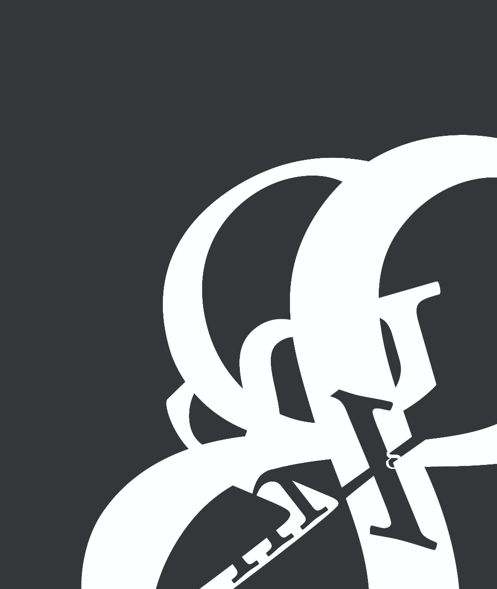

Take a peek at this project on my Behance profile here (opens a new link)